DESIGNER: LEETAO
YEAR: 2019
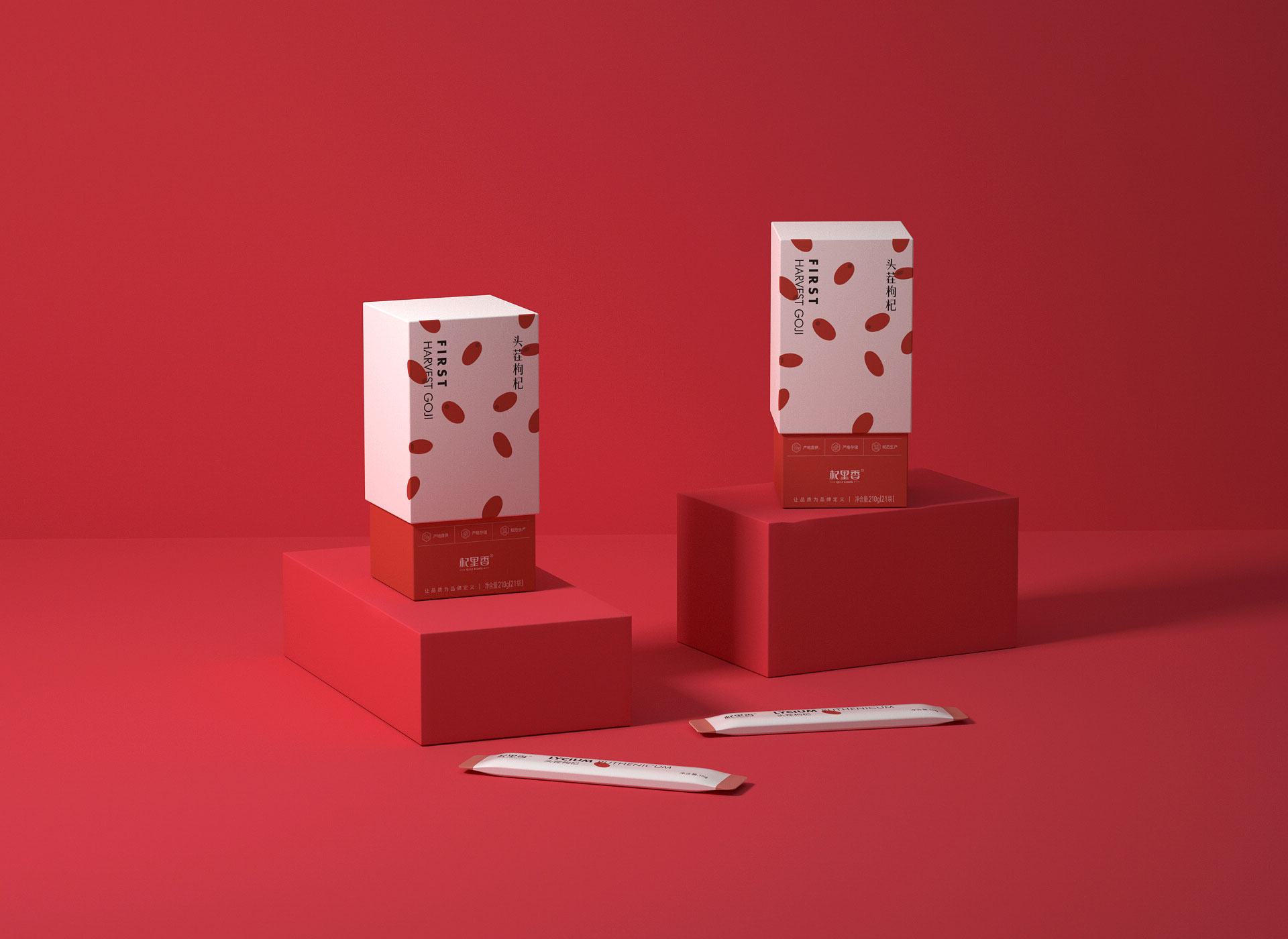
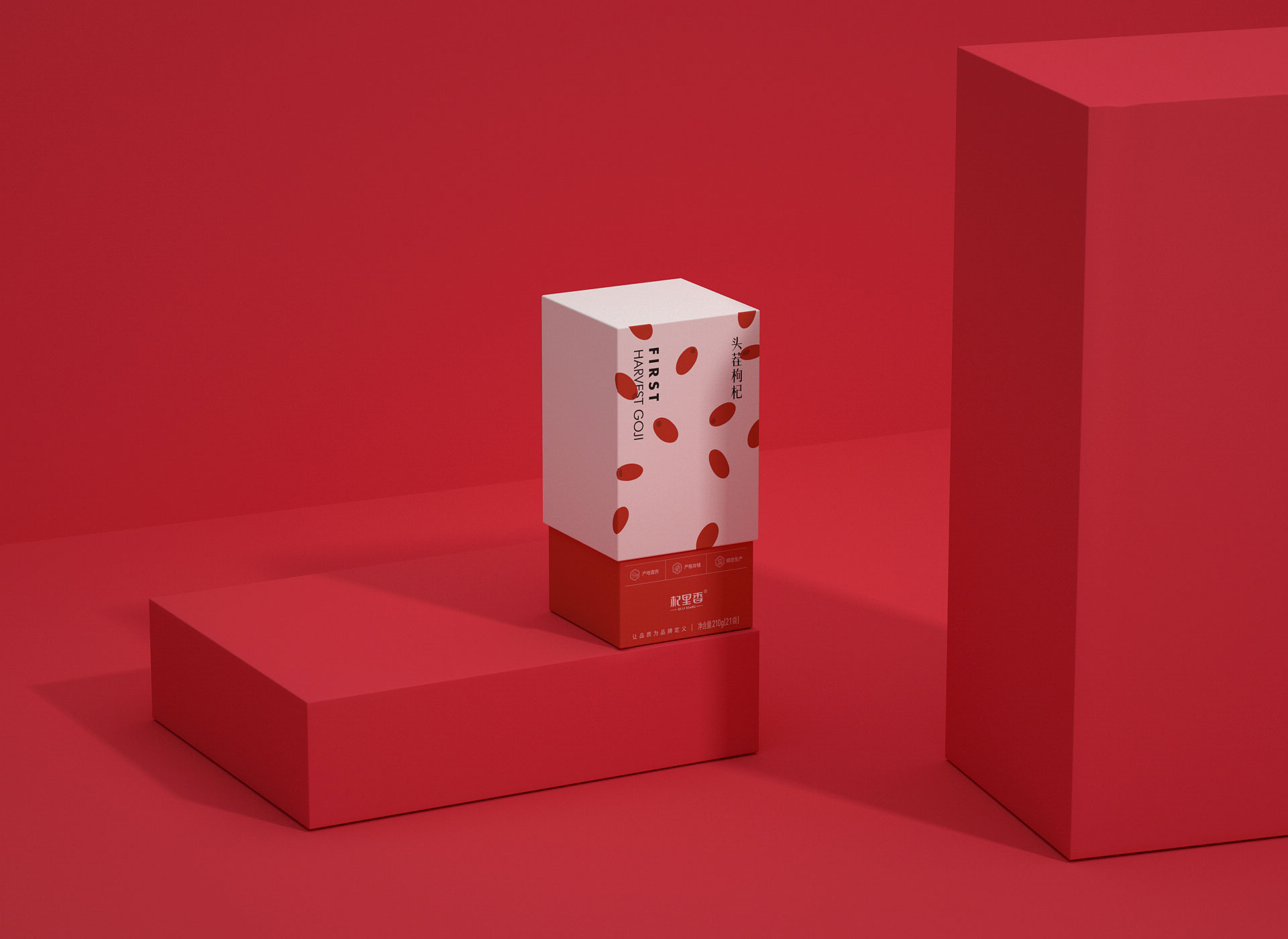
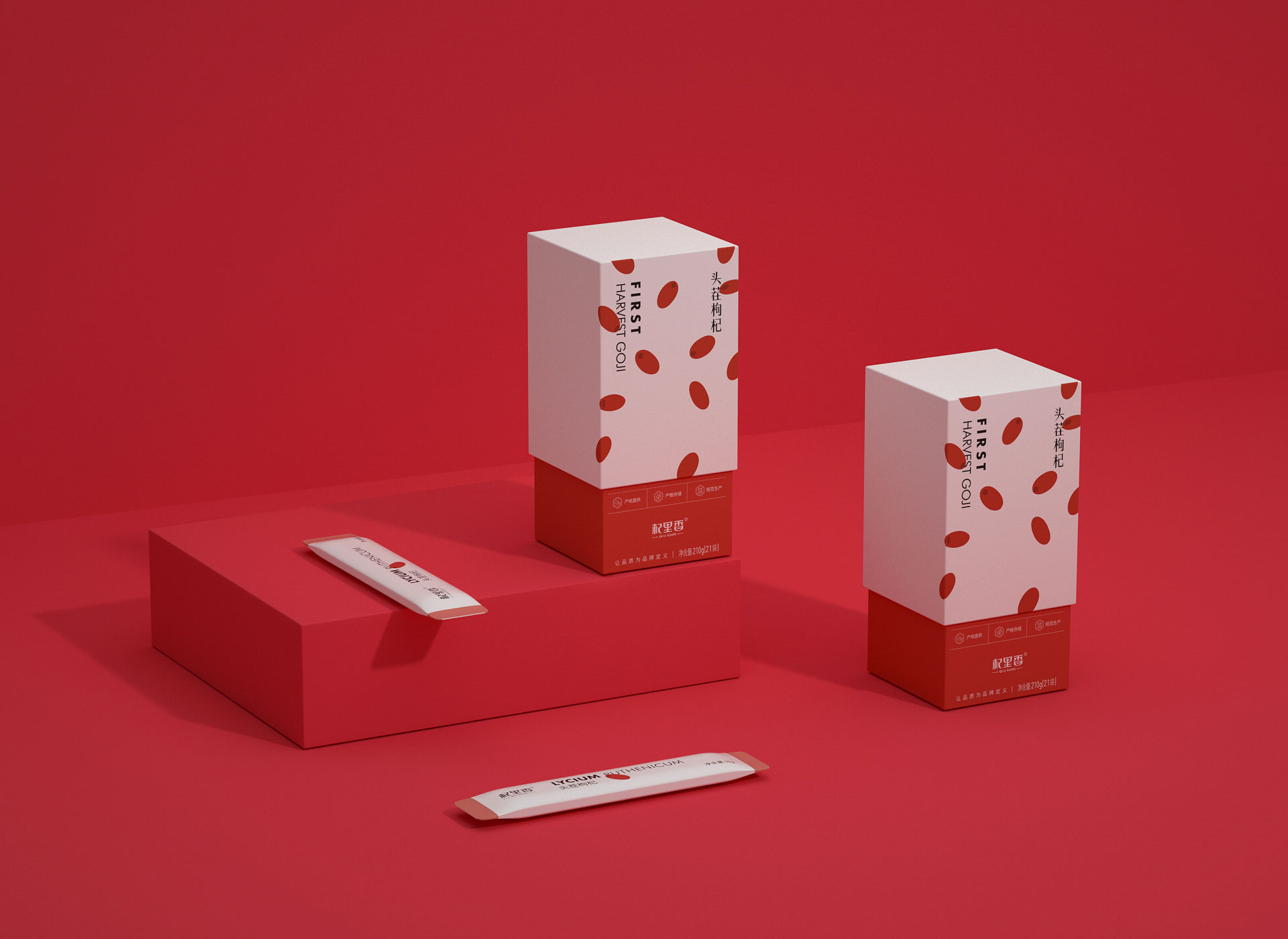
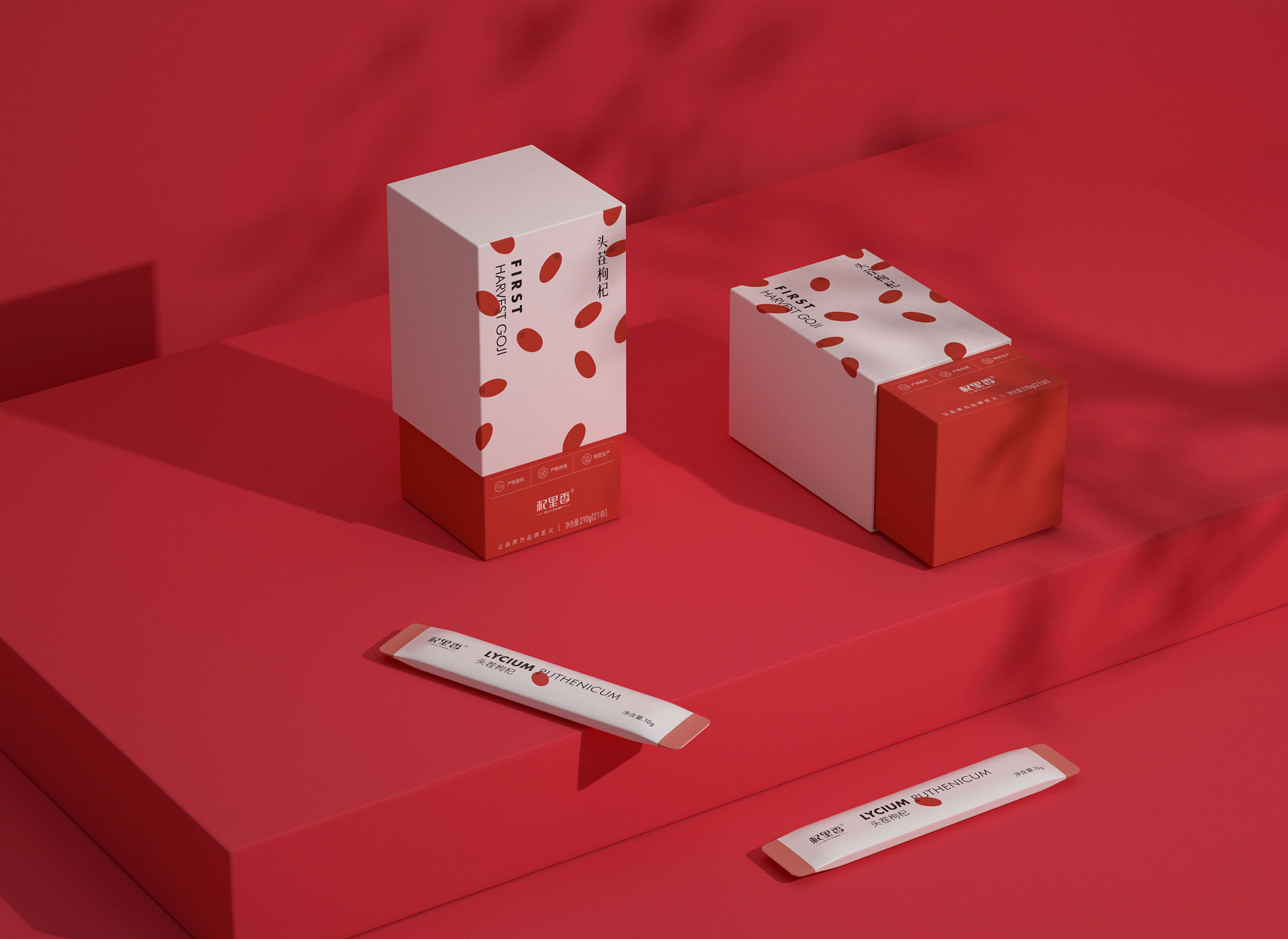
回归本质,传达真实
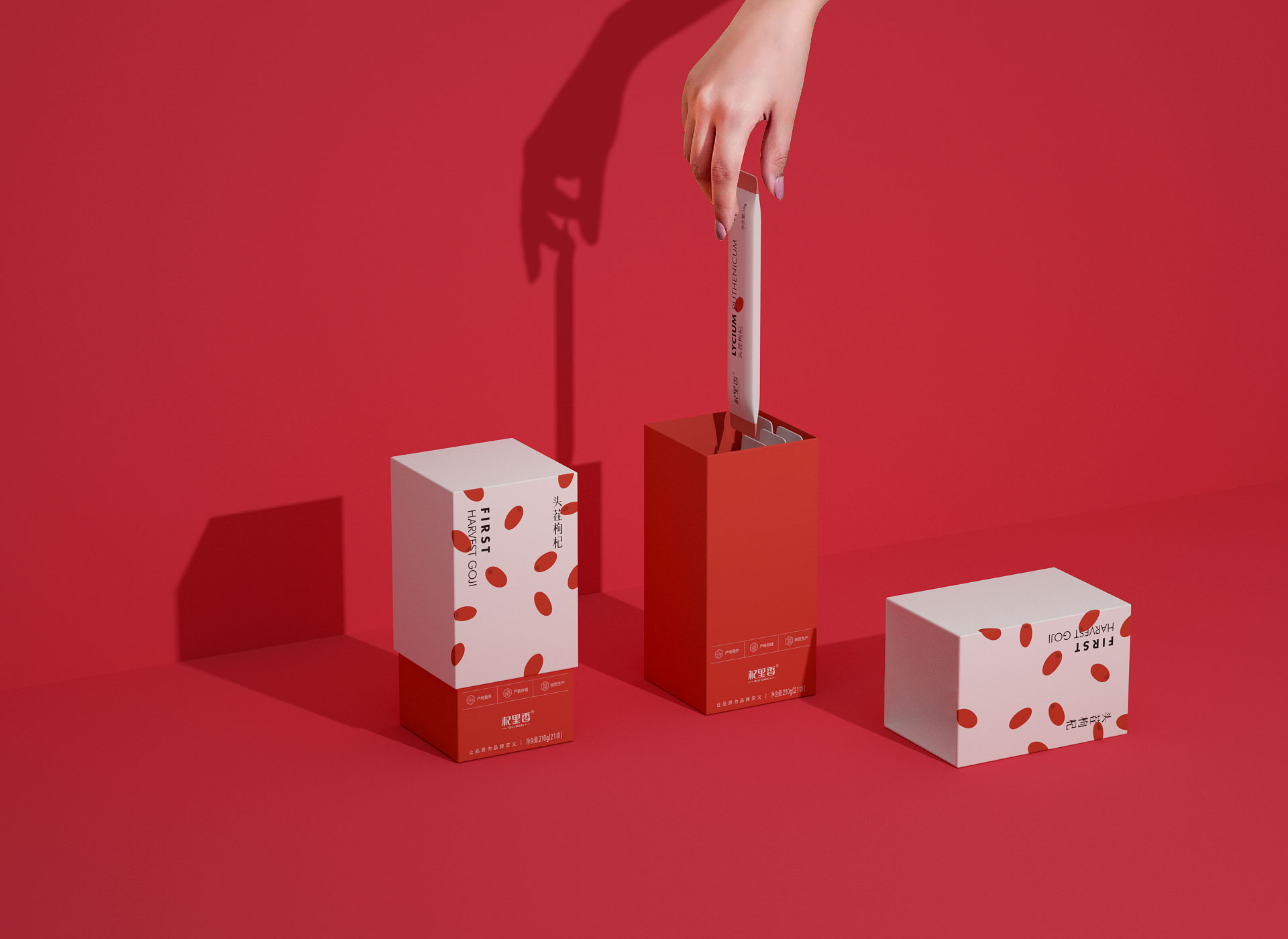
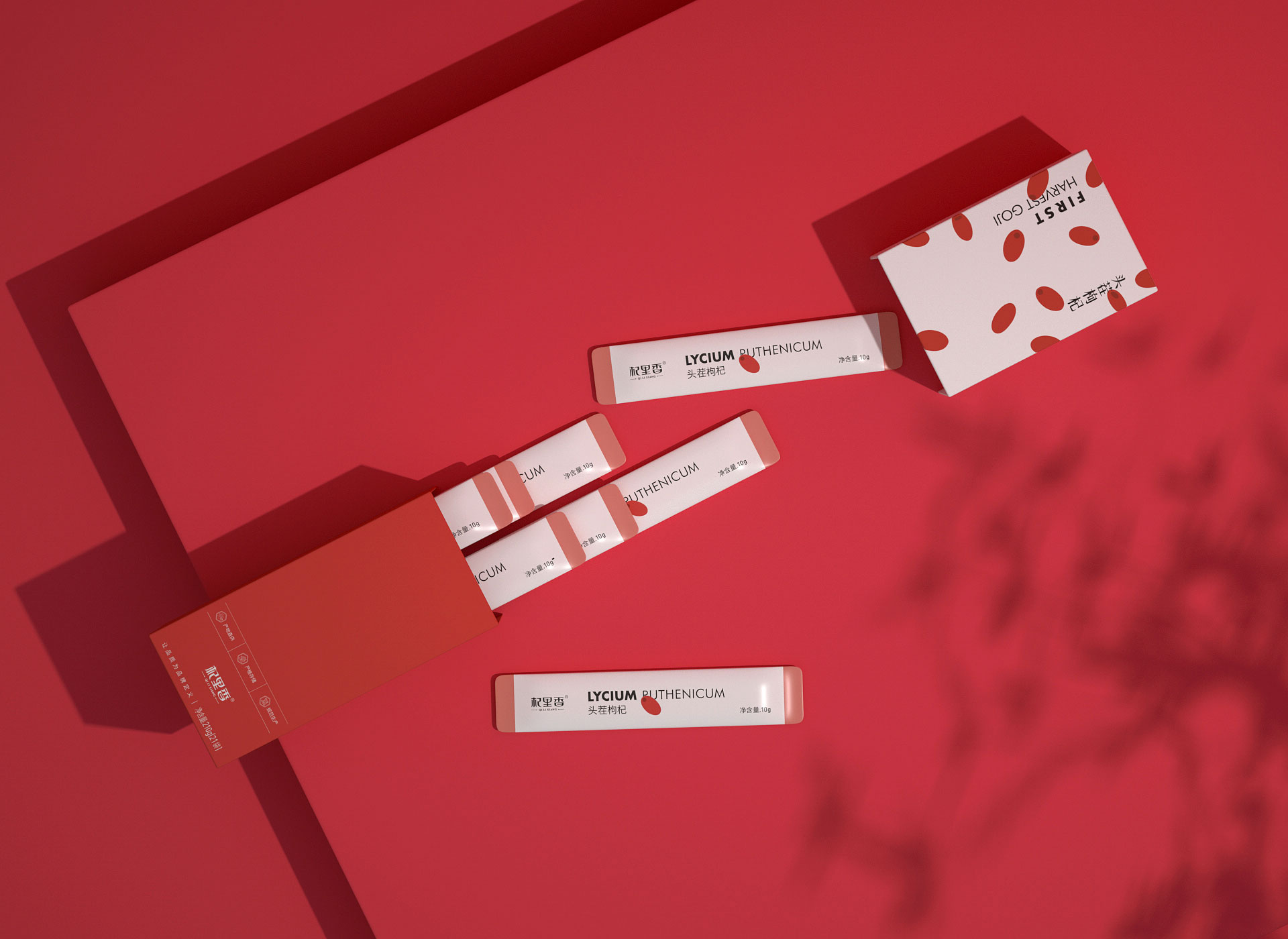
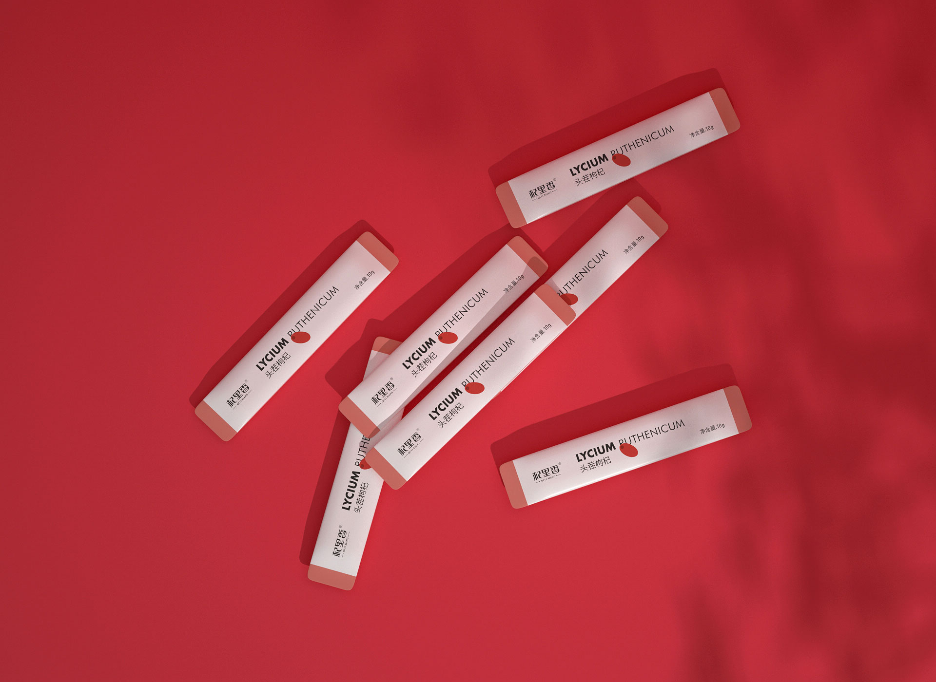
从年轻消费者日常不适中找出痛点:传统的枸杞包装融入不了日常极简的居家和办公环境中,日常滋补加料中,总会迎来一些异样目光(这么年轻就泡枸杞了…..),消费者更想选择能融入日常生活的枸杞包装。
产品定位:新年轻,新养生,新滋补。
破局符号:枸杞图形做减法构成,从传统厚重竞品视觉中造成反差
视觉对策:包装简单化,达到信息简单化,从而在画面上吸引消费者目光,促成整体枸杞竞争市场的反差,营造出年轻活力的品牌调性氛围。
Return to the essence and convey the truth Find out the pain points from the daily discomforts of young consumers: traditional wolfberry packaging cannot be integrated into the daily minimalist home and office environment. When adding daily nourishing ingredients, you will always receive some strange looks (you are soaking wolfberry at such a young age...) , consumers want to choose wolfberry packaging that can be integrated into daily life. Product positioning: new youth, new health, new nourishment. Game-breaking symbol: The wolfberry graphic is composed by subtraction, creating a contrast from the traditional heavy visual appearance of competing products. Visual strategy: simplify the packaging to simplify the information, thereby attracting consumers' attention on the screen, contributing to the contrast in the overall wolfberry competitive market, and creating a young and energetic brand atmosphere.
COPYRIGHT (©) 2026 李涛.
浙ICP备2023009421号-1
技术支持
![]()
扫描二维码分享到微信


